Semantic Wireframe
Why Semantic Wireframes
ALPS design enables visualizing the same information structure in multiple forms.
- ALPS profiles (JSON/XML) precisely define the application’s meaning structure, but are developer-oriented
- ASD (state diagrams) visualize application-wide state transitions as a graph
- Semantic wireframes visualize the same information structure as HTML pages — an extension of the traditional wireframe format
They let you reach agreement with stakeholders on information architecture before investing in visual design.
How It Works
Swap only the CSS while keeping the HTML identical — the same idea as CSS Zen Garden (2003). The difference is the purpose. CSS Zen Garden demonstrated the separation of content and presentation as a CSS technique; semantic wireframes leverage that separation as a design tool for stakeholder communication.
Every CSS class in the HTML uses only ALPS semantic descriptor IDs, with no presentation classes.
<article class="Book">
  <h2 class="bookTitle">The Art of Web Design</h2>
  <span class="price">$29.99</span>
  <a href="cart.html" class="doAddToCart">Add to Cart</a>
</article>
There are no presentation classes like container or btn-primary. Only meaning structure remains in the HTML. Styles are applied to those semantic classes, and by swapping only the CSS, three fidelity levels are achieved:
- Level 1 — Minimal readability, no layout
- Level 2 — Information skeleton (wireframe)
- Level 3 — Full design with typography, color, and responsive layout
The AI skill (alps-to-mock) or MCP tool (alps2mock) can auto-generate these from an ALPS profile.
Visual Notation
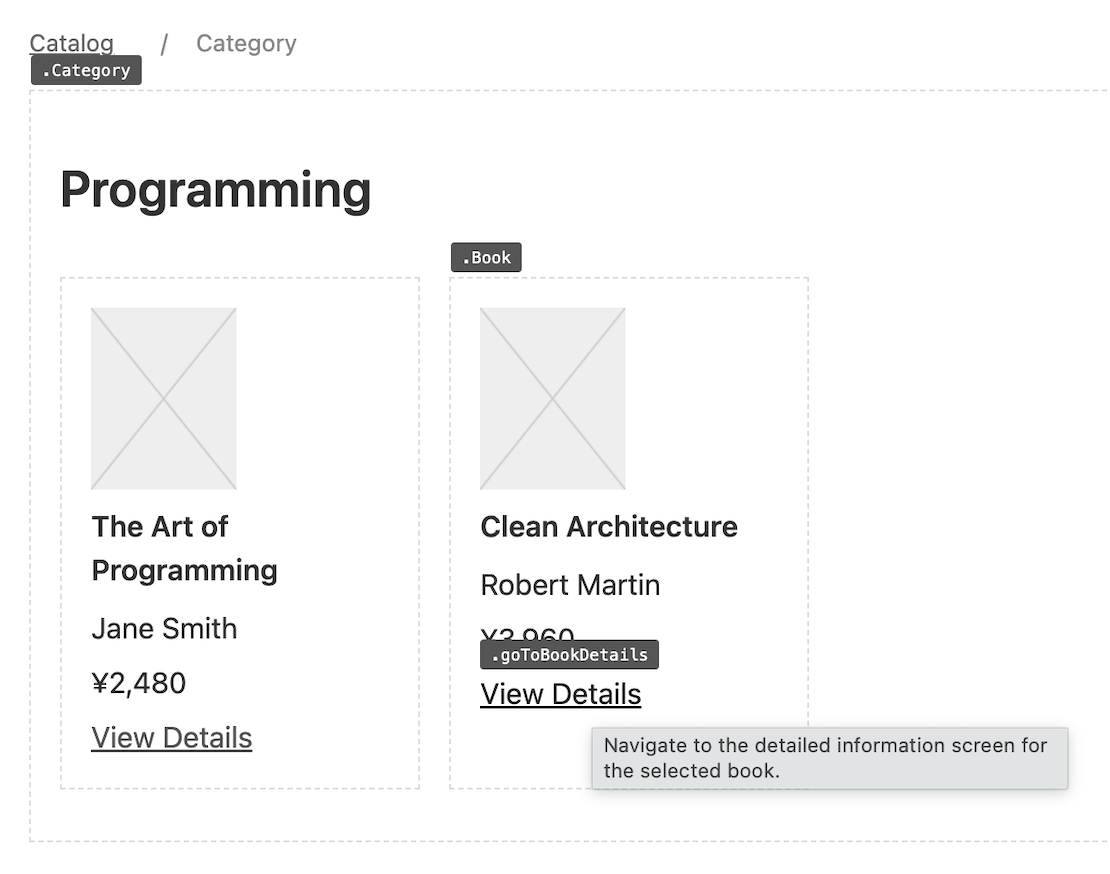
The Level 2 wireframe uses the following visual notation.
Hover Labels
Dashed Borders
section, article, and aside are outlined with dashed borders, making block structure visible
Underlined Links
go*) — read-only navigation with no side effects
Transition Types and Left Border Colors
Button left border colors distinguish transition types, using the same colors as state diagram edges.
X-box Images
Demo
See the same online bookstore information structure in three forms:
By swapping only the CSS, you can switch from the wireframe to a skeleton view or a near-production design. Compare all three fidelity levels.
AI Affinity
The HTML of a semantic wireframe is self-describing — the meaning structure is expressed directly, not buried under presentation. In typical HTML, AI must infer meaning through the noise of layout and decoration classes like flex, md:grid-cols-3, and shadow-lg. In semantic HTML, that guesswork is eliminated. Fewer tokens, more accurate understanding.